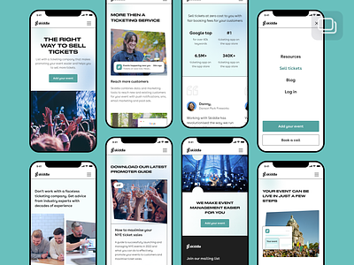
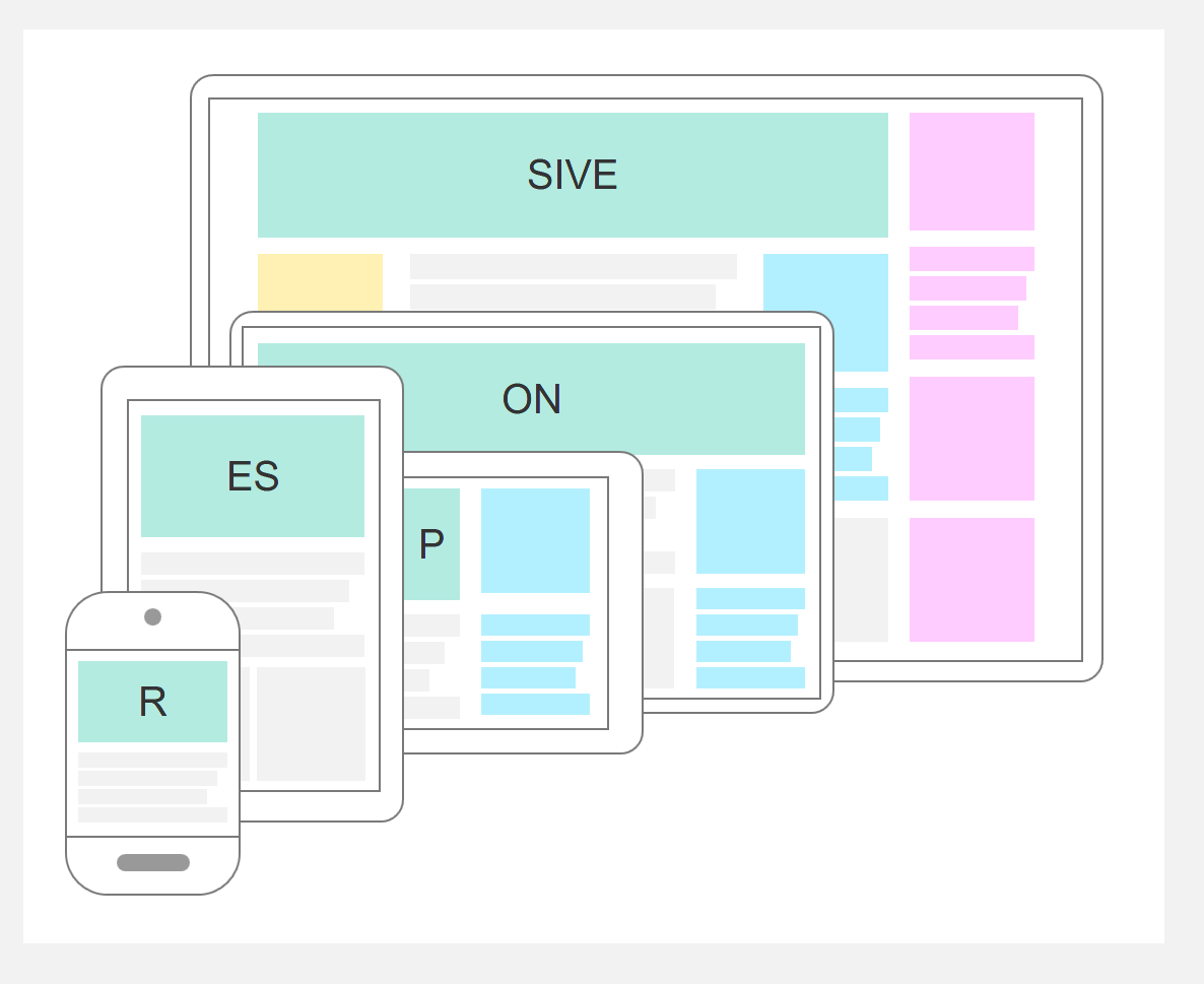
User experience (UX) and mobile responsiveness are critically important in blogging because they directly impact visitor engagement, SEO rankings, and overall site success. A blog that is mobile-responsive adapts seamlessly to various screen sizes, ensuring that users can easily navigate, read, and interact with content on any device, especially smartphones and tablets, which dominate internet usage today.
Key reasons why UX and mobile responsiveness matter in blogging include:
-
Meeting User Expectations: Users expect a consistent, smooth experience across devices. A blog that fails to adjust to different screen sizes frustrates visitors, increasing bounce rates and reducing engagement.
-
Improved Readability and Navigation: Mobile-responsive design optimizes font sizes, images, and layout for smaller screens, making content easier to read and navigate without zooming or horizontal scrolling.
-
Faster Load Times: Mobile users expect quick loading pages. Responsive design often involves optimizing images and code to improve speed, which enhances UX and reduces abandonment.
-
SEO Benefits: Search engines like Google prioritize mobile-friendly sites through mobile-first indexing. Responsive blogs rank higher in search results, attracting more organic traffic.
-
Increased Engagement and Conversion: A well-designed UX that is mobile-optimized encourages visitors to stay longer, interact with content, and return, which is essential for building a loyal readership or customer base.
-
Accessibility: Good UX and responsive design also consider accessibility features, ensuring all users, including those with disabilities, can access and benefit from the blog content.
In summary, mobile responsiveness is not just about aesthetics but about creating an intuitive, accessible, and efficient experience that meets modern user behaviors and search engine requirements. For bloggers, investing in UX and responsive design is essential to maximize reach, engagement, and success in a mobile-first digital landscape.