Mobile-First Indexing: Definition and SEO Impact
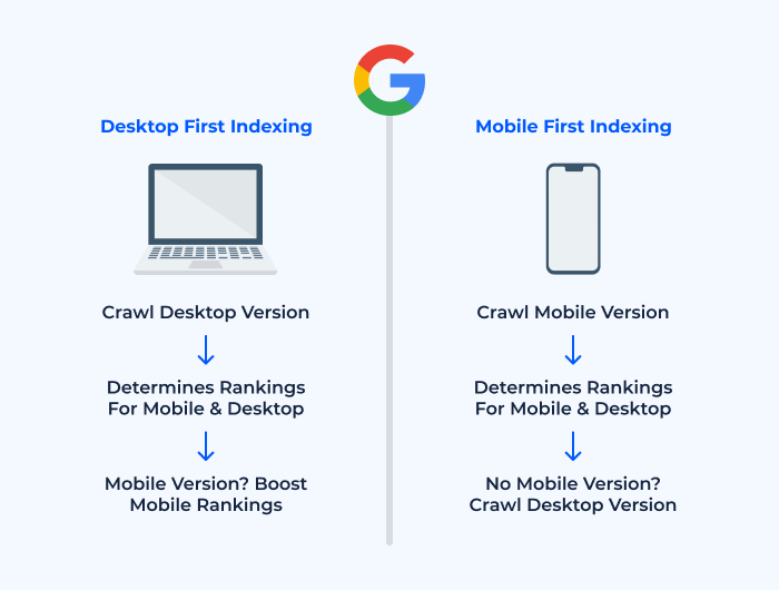
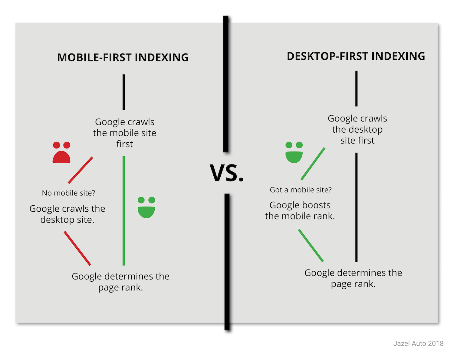
Mobile-first indexing means that Google primarily uses the mobile version of a website for indexing and ranking in search results, reflecting the dominance of mobile internet usage. Since March 2021, Google has stopped indexing desktop-only webpages, making mobile optimization essential for visibility in search engine results pages (SERPs). If your site is not mobile-friendly, it risks lower rankings or even exclusion from Google’s index, regardless of how well-optimized the desktop version may be.
Key implications for SEO:
- Priority to mobile content: The mobile version’s content, structure, and performance directly influence your rankings.
- Content parity: Ensure that the mobile site offers the same content, images, and functionality as the desktop version to avoid ranking penalties.
- User experience: A poor mobile experience leads to higher bounce rates and lower engagement, negatively impacting SEO.
- Local SEO: Mobile optimization is especially critical for local businesses, as mobile users often search for nearby services.
Responsive Design: Role in Mobile-First SEO
Responsive web design is an approach where a single website automatically adjusts its layout, images, and content to fit any screen size—smartphone, tablet, or desktop. This eliminates the need for separate mobile and desktop sites, streamlining maintenance and ensuring consistency.
Why responsive design is crucial for SEO:
- Google’s preference: Google explicitly recommends responsive design as the best practice for mobile-first indexing, as it provides a consistent user experience across devices.
- Avoids duplicate content: A single responsive site prevents issues with duplicate content that can arise from maintaining separate mobile and desktop URLs.
- Improved usability: Responsive sites are easier to navigate on small screens, reducing bounce rates and improving time-on-site metrics—both positive SEO signals.
- Easier maintenance: Managing one site is more efficient than maintaining multiple versions, reducing the risk of inconsistencies and errors.
Best Practices for Mobile-First and Responsive SEO
- Test mobile-friendliness: Use tools like Google’s Mobile-Friendly Test to identify and fix issues.
- Optimize page speed: Compress images, minify code, and leverage caching to ensure fast loading on mobile devices.
- Ensure content parity: All important content, including text, images, videos, and structured data, should be present and accessible on the mobile version.
- Focus on user experience: Design for touch navigation, readable fonts, and avoid intrusive interstitials.
- Monitor and iterate: Regularly review mobile performance metrics and user feedback to continuously improve the experience.
Summary Table: Mobile-First Indexing vs. Responsive Design
| Aspect | Mobile-First Indexing | Responsive Design |
|---|---|---|
| Primary Focus | Uses mobile version for indexing/ranking | Adapts layout to any device |
| SEO Impact | Essential for visibility; non-mobile sites risk penalties | Preferred by Google; avoids duplicate content |
| User Experience | Mobile UX directly affects rankings | Seamless experience across all devices |
| Maintenance | Requires content parity between mobile/desktop | Single site, easier to manage |
| Best Practice | Optimize for mobile performance and content | Use flexible grids, media queries, fluid images |
Conclusion
Mobile-first indexing has made mobile optimization a non-negotiable aspect of SEO, with Google prioritizing the mobile experience in its ranking algorithms. Responsive design is the most effective way to meet these requirements, ensuring your site is accessible, user-friendly, and SEO-optimized across all devices. Websites that fail to adapt risk significant losses in visibility, traffic, and conversions in today’s mobile-dominated landscape.