Core Mobile Optimization Strategies for Software Service Websites
Optimizing a software service (SaaS) website for mobile is essential, as mobile traffic now exceeds 60% of all internet usage. Effective mobile optimization improves user experience, boosts engagement, and supports better search rankings. Below are the most impactful strategies, supported by current best practices.
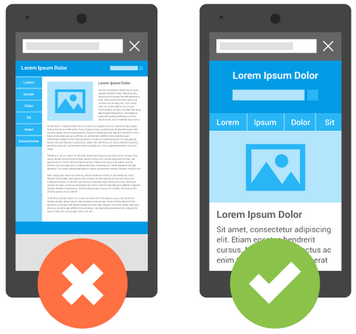
Responsive and Mobile-First Design
- Implement Responsive Design: Ensure your website automatically adjusts to any screen size, providing a consistent experience across devices. Use fluid grids and flexible images to maintain layout integrity.
- Adopt a Mobile-First Approach: Design the mobile experience before the desktop version. This prioritizes the needs of mobile users and streamlines content and navigation from the outset.
- Test Across Devices: Use tools like Responsive Design Checker to preview your site on various devices and screen sizes, ensuring compatibility for all users.
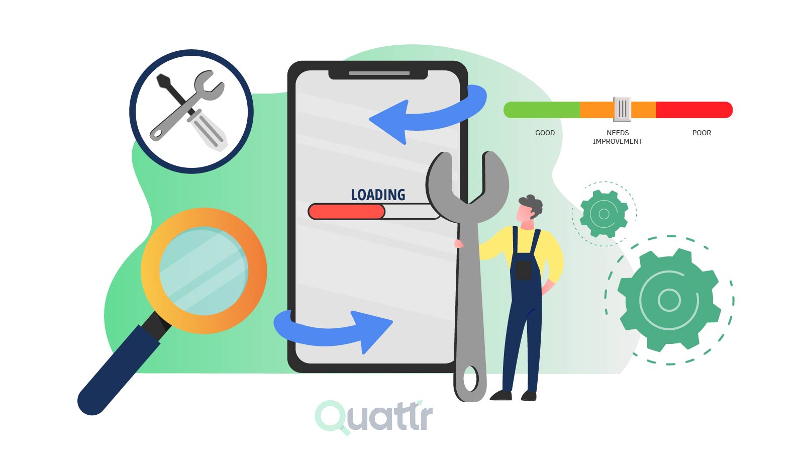
Performance Optimization
- Speed Up Load Times: Mobile users expect fast loading; even a one-second delay can increase bounce rates. Compress images (use WebP or AVIF formats), minify CSS/JS/HTML, leverage browser caching, and reduce HTTP requests.
- Use a CDN: A Content Delivery Network (CDN) reduces latency by serving content from servers closest to the user, significantly improving load times.
- Lazy Loading: Load images and videos only as they come into the viewport, reducing initial page weight.
- AMP (Accelerated Mobile Pages): Consider implementing AMP for critical pages to achieve near-instant loading on mobile devices.
User Experience Enhancements
- Simplify Navigation: Use hamburger menus, sticky headers, and collapsible sections to make navigation intuitive and clutter-free. Ensure CTAs (call-to-actions) are prominent and easy to tap.
- Optimize Forms: Mobile users find complex forms frustrating. Ask for minimal information, use autofill, and ensure form fields are large enough for touch input.
- Readable Content: Use large, sans-serif fonts and limit text per page. Break content into digestible sections with clear headings.
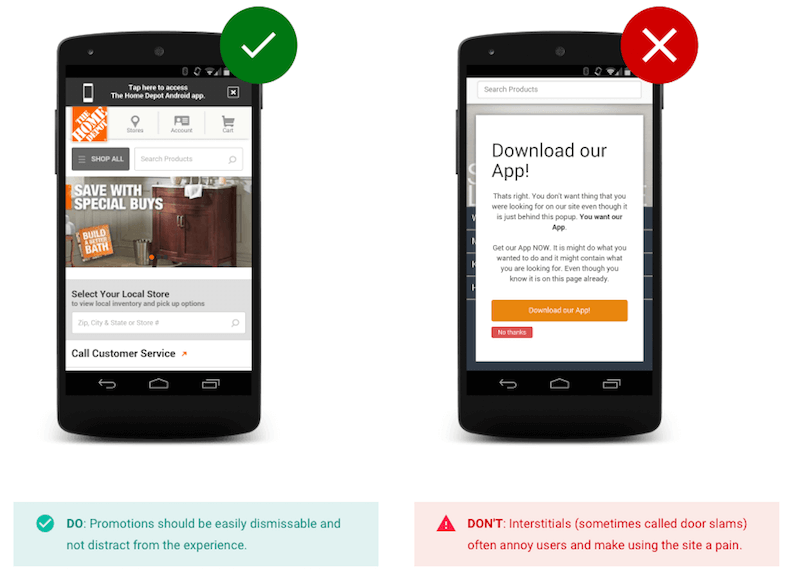
- Minimize Pop-Ups: Avoid intrusive pop-ups that disrupt the mobile experience.
Technical and SEO Considerations
- Mobile-First Indexing: Google primarily uses the mobile version of your site for ranking. Ensure mobile and desktop content is equivalent, and avoid blocking CSS/JS.
- Regular Testing: Use tools like Google’s Mobile-Friendly Test and PageSpeed Insights to identify and fix issues.
- Image Optimization: Serve appropriately sized images using responsive techniques (e.g., srcset) to avoid unnecessary data usage.
Advanced Options
- Mobile Apps: For a fully optimized experience, consider converting your website into a native mobile app using platforms like MobiLoud, which can enhance navigation and engagement beyond what’s possible in a browser.
- Progressive Web Apps (PWAs): PWAs offer app-like experiences directly in the browser, with offline capabilities and push notifications.
Summary Table: Key Mobile Optimization Tactics
| Strategy | Description | Tools/Techniques |
|---|---|---|
| Responsive Design | Adapts layout to any screen size | Fluid grids, flexible images |
| Mobile-First Approach | Design for mobile first, then scale up | Prototyping, user testing |
| Speed Optimization | Fast load times via compression, CDN, lazy loading | GTmetrix, PageSpeed Insights, CDN |
| Simplified Navigation | Intuitive, touch-friendly menus and CTAs | Hamburger menu, sticky header |
| Form Optimization | Minimal, easy-to-complete forms | Autofill, large input fields |
| Content Readability | Large fonts, concise text, clear headings | Sans-serif fonts, content chunking |
| Regular Testing | Ensure ongoing mobile compatibility and performance | Google Mobile-Friendly Test |
| Advanced Options | Native apps or PWAs for deeper engagement | MobiLoud, PWA frameworks |
Conclusion
A successful mobile optimization strategy for software service websites combines responsive, mobile-first design with rigorous performance tuning, intuitive navigation, and regular testing. Prioritizing these areas will enhance user satisfaction, reduce bounce rates, and improve your site’s visibility in search results.