The pricing differences between responsive and adaptive mobile design primarily stem from their development and maintenance complexities.
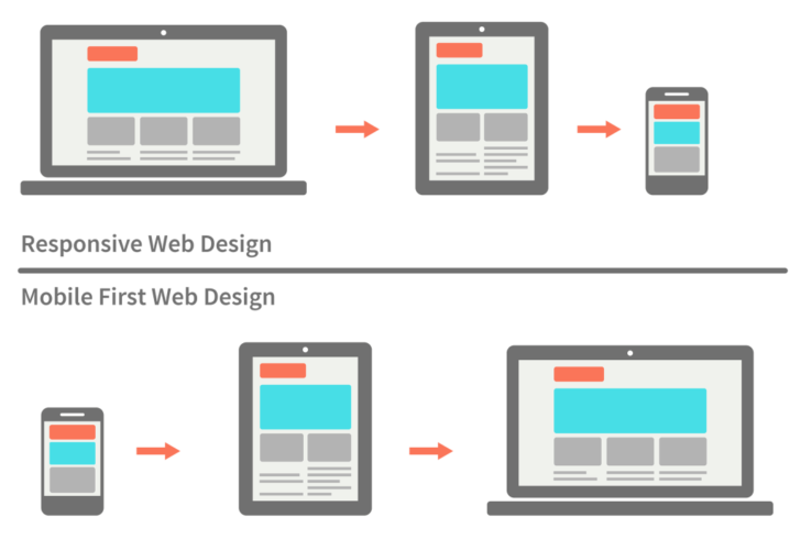
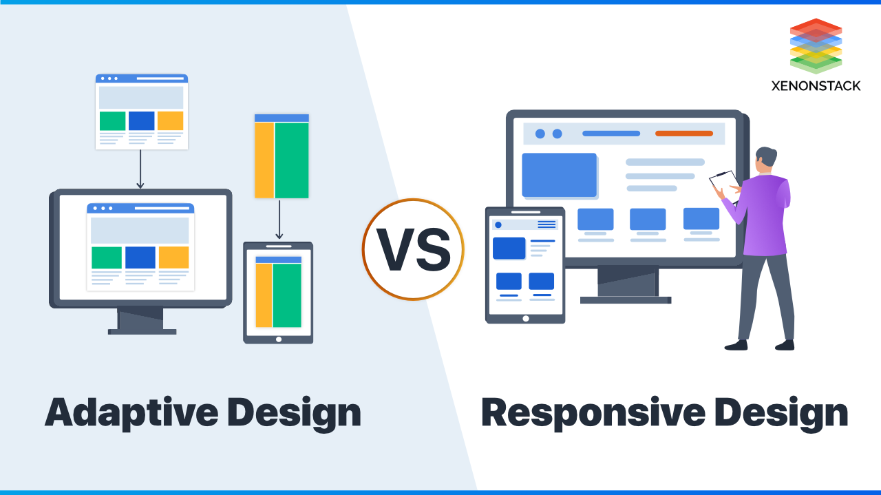
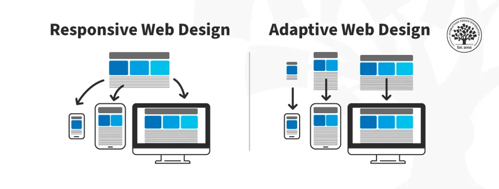
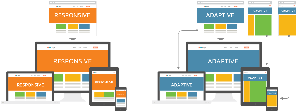
Responsive design generally has lower long-term costs because it uses a single fluid layout that adjusts automatically to any screen size, requiring only one codebase to develop and maintain. Although the initial development might be somewhat resource-intensive due to the need for flexible layouts and extensive testing, ongoing maintenance is simpler and cheaper since changes are made once for all devices.
Adaptive design, on the other hand, involves creating multiple fixed layouts tailored to specific device categories (e.g., mobile, tablet, desktop). This approach offers more control over the user experience on each device but requires higher upfront development costs and greater maintenance expenses because each layout must be individually designed, developed, and updated.
Key points on pricing differences:
| Aspect | Responsive Design | Adaptive Design |
|---|---|---|
| Development Cost | Moderate to high initially (single flexible layout) | Higher due to multiple fixed layouts |
| Maintenance Cost | Lower (one codebase to update) | Higher (multiple layouts to maintain) |
| Long-term Cost | Generally lower due to easier upkeep | Higher due to complexity and updates |
| Control over UX | Less granular, uniform experience | More granular, device-specific control |
| Testing Requirements | Extensive to ensure fluid adaptability | Focused on specific device layouts |
In summary, responsive design is more cost-effective over time, especially for businesses with budget constraints or those seeking easier maintenance. Adaptive design demands a higher budget upfront and ongoing but can deliver a more tailored experience on specific devices, which might justify the cost for established brands prioritizing precise control over user experience.