To optimize website structure and mobile-friendliness for SEO, focus on creating a clear, logical site architecture combined with a responsive, fast-loading mobile design.
Key website structure optimizations for SEO:
- Use a flat site architecture where important pages are reachable within three clicks from the homepage to improve crawlability and user experience.
- Implement an SEO-friendly URL structure: short, descriptive, lowercase URLs with hyphens, organized into logical directories reflecting content hierarchy and topic clusters.
- Organize content into pillar pages and topic clusters to establish topical authority and improve internal linking, helping search engines understand relationships between pages.
- Avoid orphan pages by ensuring all pages are linked internally, improving indexing and user navigation.
- Use strategic header tags (H1, H2, H3) to structure content clearly for both users and search engines.
Mobile-friendliness best practices for SEO:
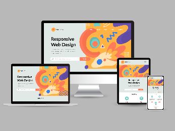
- Build a responsive website that automatically adjusts layout and content based on device screen size, orientation, and platform, ensuring usability across all mobile devices.
- Optimize page load speed by compressing images, minimizing code, and leveraging efficient CSS and JavaScript to reduce bounce rates and improve rankings.
- Design touch-friendly elements: buttons and links should be large enough and spaced to avoid tapping errors on small screens.
- Use a minimum font size of 16px for readability and ensure content fits well on mobile screens without horizontal scrolling.
- Remove intrusive pop-ups and avoid blocking essential resources like JavaScript, HTML, and CSS to ensure Google can crawl and render your mobile site properly.
- Implement structured data consistently on mobile and desktop versions to enhance search result appearance and indexing.
- Regularly test your site with tools like Google’s Mobile-Friendly Test and PageSpeed Insights to maintain optimal mobile performance.
By combining a well-planned, SEO-friendly site structure with a fast, responsive, and user-friendly mobile design, you improve both search engine crawlability and user experience, which are critical ranking factors in 2025 and beyond.